_150.jpg)
Corne_Akkers
-
 ArtistCorné Akkers
 -
 Typeimage
 -
 Dimensions14.8 x 21 x 0.1 cm
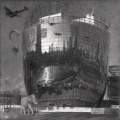
Old and New This graphite pencil drawing ‘Den Haag – Nieuwe Kerk – 28-05-23’ takes me back to my present residence. There is this remarkable church...
Old and New This graphite pencil drawing ‘Den Haag – Nieuwe Kerk – 28-05-23’ takes me back to my present residence. There is this remarkable church smack in the middle of The Hague that’s ancient. It deviates slighty from its direct surroundings. Take City Hall on the other side of the street (Spui) for example, designed by famous architect Richard Meier. Such is life here, full of contrasts in old and new. Another example is Burger King, farther down that same road. Perhaps it is not very imaginable for Americans. I’m talking about the franchise appearance and the architectural beauty of the facade above it. It’s that much big a contrast that they almost look like two separate buildings stacked on top of eachother. Could it be that such contrasts also represent a inner felt separation in many people nowadays. What do you think? They’re Back! Not that I detest change. That’s always needed and I also try to incorporate it as theme in my works througout the yea

